 i feel a blog on vancouver is quite appropriate for the week. the games are going great, but what i want to discuss is this olympics artwork. canada wanted the artwork to be different from any of the other games. they didn't want there to be cliche graphics such as mountains or maple leafs. the graphics speak nothing of canada's history except for the logo, which is rather indiginous. the artwork is actually very contemporary and shows their lifestyle of art and life. the artwork as seen above are all like this, although different. they share similar charachteristics but are all different in their own way. they are used in all of the products from tickets to banners. for a more complete description of the artwork click on the artwork above. i love this style canada decided to take with the games. it is something that "is in" and is also fun and inviting. GO USA!
Thursday, February 18, 2010
my 6th blog : vancouver
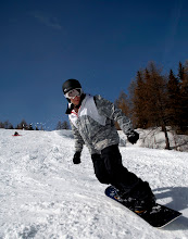
i feel a blog on vancouver is quite appropriate for the week. the games are going great, but what i want to discuss is this olympics artwork. canada wanted the artwork to be different from any of the other games. they didn't want there to be cliche graphics such as mountains or maple leafs. the graphics speak nothing of canada's history except for the logo, which is rather indiginous. the artwork is actually very contemporary and shows their lifestyle of art and life. the artwork as seen above are all like this, although different. they share similar charachteristics but are all different in their own way. they are used in all of the products from tickets to banners. for a more complete description of the artwork click on the artwork above. i love this style canada decided to take with the games. it is something that "is in" and is also fun and inviting. GO USA!
Subscribe to:
Post Comments (Atom)
No comments:
Post a Comment